Frontend Architecture
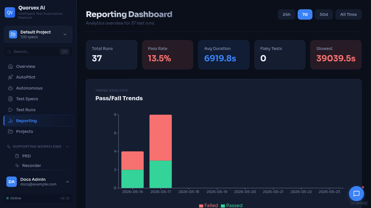
Quorvex dashboard overview showing frontend layout and navigation.
How the Next.js dashboard shell composes pages, providers, navigation, and shared UI behavior.
Why the Dashboard Uses a Shell
The dashboard is a dense operational surface. Most pages need the same runtime context: authentication, selected project, command palette, assistant state, sidebar navigation, notifications, and responsive layout. The app shell centralizes these concerns so individual pages can focus on feature data and workflows.
graph TD
  A["Root layout"] --> B["Providers"]
  B --> C["Dashboard layout"]
  C --> D["ChatProvider"]
  C --> E["CommandPaletteProvider"]
  C --> F["Sidebar"]
  C --> G["Page content"]
  G --> H["Feature pages"]
Route Groups
The dashboard uses Next.js App Router route groups:
| Area | Path pattern | Purpose |
|---|---|---|
| Auth | web/src/app/(auth)/ | Login and registration pages |
| Dashboard | web/src/app/(dashboard)/ | Authenticated product pages |
| API routes | web/src/app/api/ | Next.js server routes for assistant and tool execution |
| Backend proxy | web/src/app/backend-proxy/[...path]/route.ts | Proxy browser requests to the backend in deployed environments |
Route groups do not appear in URLs. A page under web/src/app/(dashboard)/memory/page.tsx is served at /memory.
Provider Responsibilities
| Provider or shell component | Main source | Responsibility |
|---|---|---|
Providers | web/src/components/Providers.tsx | Root client providers for global dashboard behavior |
AuthProvider | web/src/contexts/AuthContext.tsx | Access token state, refresh token flow, authenticated fetch helper |
ProjectProvider | web/src/contexts/ProjectContext.tsx | Selected project and project-scoped state |
ChatProvider | web/src/components/assistant/ChatProvider.tsx | Assistant runtime, conversation state, message conversion |
CommandPaletteProvider | web/src/components/command-palette/CommandPaletteProvider.tsx | Keyboard command search and execution |
Sidebar | web/src/components/Sidebar.tsx | Grouped navigation and route highlighting |
Provider order matters when a child provider or component needs auth or project context. Feature pages should use existing hooks instead of creating parallel local state for these concerns.
Navigation Model
Sidebar navigation is defined in web/src/components/Sidebar.tsx. Command palette navigation is defined separately in web/src/components/command-palette/command-data.ts.
When adding a dashboard page, keep both surfaces aligned:
- route file under
web/src/app/(dashboard)/ - sidebar entry in the appropriate group
- command palette entry with useful keywords
- documentation entry in
docs/reference/web-dashboard.mdwhen the page is public
Page Composition
Feature pages should prefer shared primitives for consistent behavior:
PageLayoutfor common spacing and widthPageHeaderfor title, description, and actionsListPageSkeleton,GridPageSkeleton, orDashboardPageSkeletonduring loadingEmptyStatewhen a filtered or new project has no dataStatusBadgeandSeverityBadgefor normalized status colors- shared
Button,Input,Dialog,Table,Tabs, andSelectcomponents
Local page components are appropriate when the component is tightly bound to one domain. Shared components belong under web/src/components/ui/ or web/src/components/shared/ only when multiple pages need the same contract.
Server and Browser Boundaries
Most dashboard pages are client components because they use auth context, project context, polling, or browser-local interaction. Server routes under web/src/app/api/ should handle server-only assistant/provider work and call the backend through web/src/lib/ai/backend-client.ts.
Browser requests should use API_BASE from web/src/lib/api.ts; server routes should use INTERNAL_API_URL through backend client helpers.