Dashboard UI Patterns
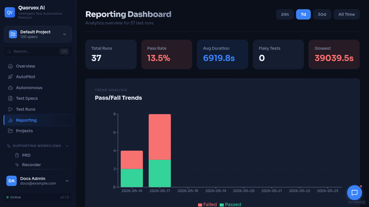
Quorvex dashboard overview showing shared UI patterns.
Reference for shared dashboard components and styling primitives.
Layout Components
| Component | Source | Use for |
|---|---|---|
PageLayout | web/src/components/ui/page-layout.tsx | Standard page spacing, width, and optional header region |
PageHeader | web/src/components/ui/page-header.tsx | Page title, description, and primary actions |
Sidebar | web/src/components/Sidebar.tsx | Primary dashboard navigation |
CommandPalette | web/src/components/command-palette/CommandPalette.tsx | Keyboard navigation and quick actions |
Loading States
| Component | Source | Use for |
|---|---|---|
ListPageSkeleton | web/src/components/ui/page-skeleton.tsx | List and table-heavy pages |
GridPageSkeleton | web/src/components/ui/page-skeleton.tsx | Card grid pages |
FormPageSkeleton | web/src/components/ui/page-skeleton.tsx | Settings and form pages |
DashboardPageSkeleton | web/src/components/ui/page-skeleton.tsx | Metric-card dashboard pages |
Skeleton | web/src/components/ui/skeleton.tsx | Small local placeholders |
Empty and Error States
| Component | Source | Use for |
|---|---|---|
EmptyState | web/src/components/ui/empty-state.tsx | No data, no search results, or first-use states |
Alert | web/src/components/ui/alert.tsx | Inline warnings and errors |
ConfirmDialog | web/src/components/ui/confirm-dialog.tsx | Destructive or irreversible actions |
Status Presentation
| Component or helper | Source | Use for |
|---|---|---|
StatusBadge | web/src/components/shared/StatusBadge.tsx | Run, job, workflow, and task status labels |
SeverityBadge | web/src/components/shared/SeverityBadge.tsx | Security or quality severity labels |
severityColor() | web/src/lib/colors.ts | Inline severity color decisions |
statusColor() | web/src/lib/colors.ts | Inline status color decisions |
getResponseTimeColor() | web/src/lib/colors.ts | API and load-test response time coloring |
getErrorRateColor() | web/src/lib/colors.ts | Load-test and API error-rate coloring |
Form and Control Primitives
| Component | Source |
|---|---|
Button | web/src/components/ui/button.tsx |
Input | web/src/components/ui/input.tsx |
Label | web/src/components/ui/label.tsx |
Select | web/src/components/ui/select.tsx |
Switch | web/src/components/ui/switch.tsx |
Tabs | web/src/components/ui/tabs.tsx |
Dialog | web/src/components/ui/dialog.tsx |
DropdownMenu | web/src/components/ui/dropdown-menu.tsx |
Table | web/src/components/ui/table.tsx |
Legacy Style Helpers
web/src/lib/styles.ts exports inline style objects such as cardStyle, btnPrimary, btnSecondary, inputStyle, thStyle, and tdStyle.
Use these only when working in pages that already use inline style helpers. New or heavily updated dashboard surfaces should prefer shared UI components and Tailwind-compatible class composition.
Navigation Surfaces
| Surface | Source | Update when |
|---|---|---|
| Sidebar | web/src/components/Sidebar.tsx | A page belongs in primary navigation for repeated use |
| Command palette | web/src/components/command-palette/command-data.ts | A page or action should be discoverable by keyboard search |
| Dashboard reference | docs/reference/web-dashboard.md | A public page, status label, or dashboard concept changes |
Some valid routes are intentionally command-palette-only, floating-assistant-only, or direct-link admin pages. Document that discoverability level in Web Dashboard when adding or changing a route.